Project 06 / 2020
SABC
Visual ID.
A proposed visual identity system for the Swiss American Business Council, bringing U.S. and Swiss elements together in one mark.
- Client
- Swiss American Business Council
- Year
- 2020 · 18 weeks
- Role
- Lead designer
- Context
- UIC School of Design, mentored by Marcia Lausen
The
brief
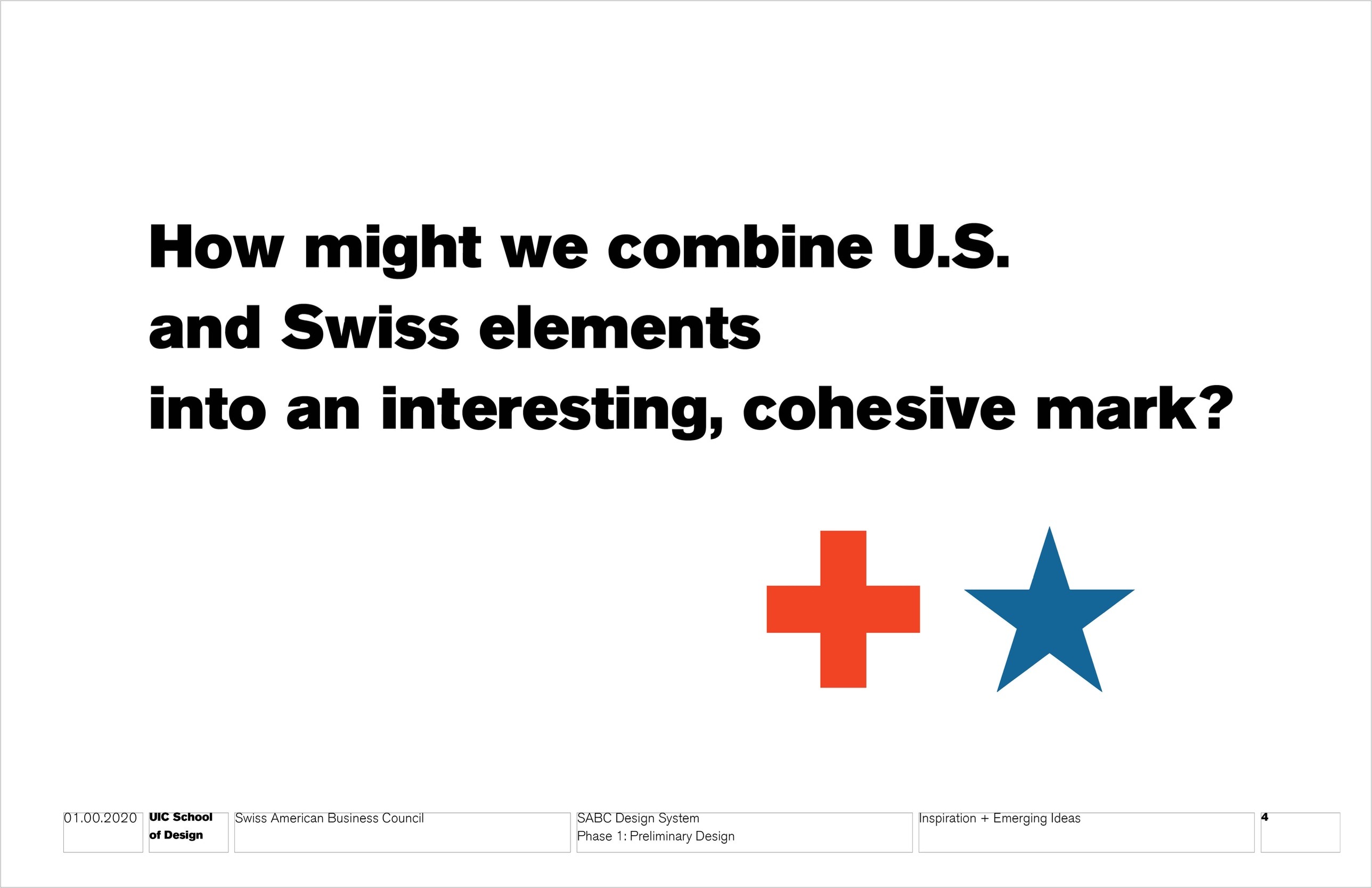
How might we combine U.S. and Swiss elements into an interesting, cohesive mark?
Over 18 weeks at the UIC School of Design, I led the design of a new identity for the Swiss American Business Council, moving from research and inspiration through logo studies to a proposed mark and the system around it.
Research
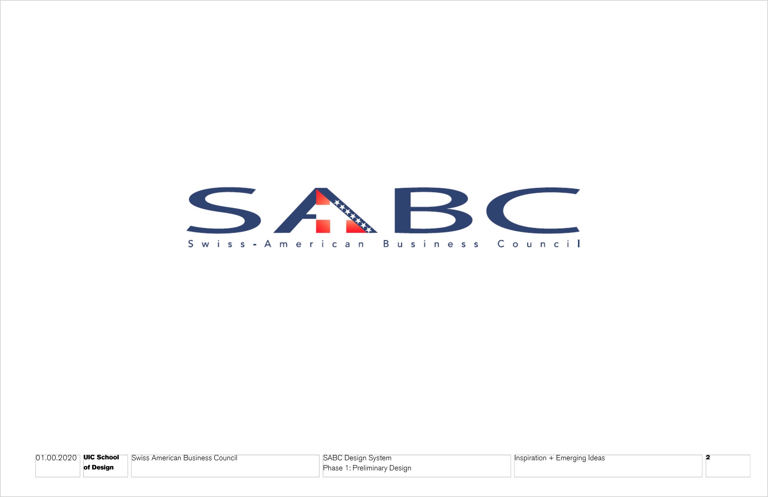
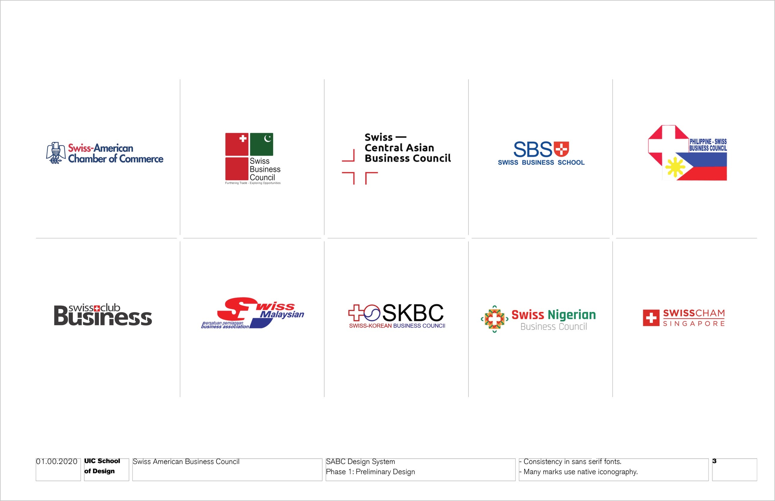
The council's existing logo, and a look at how other Swiss business councils present themselves.
Inspiration
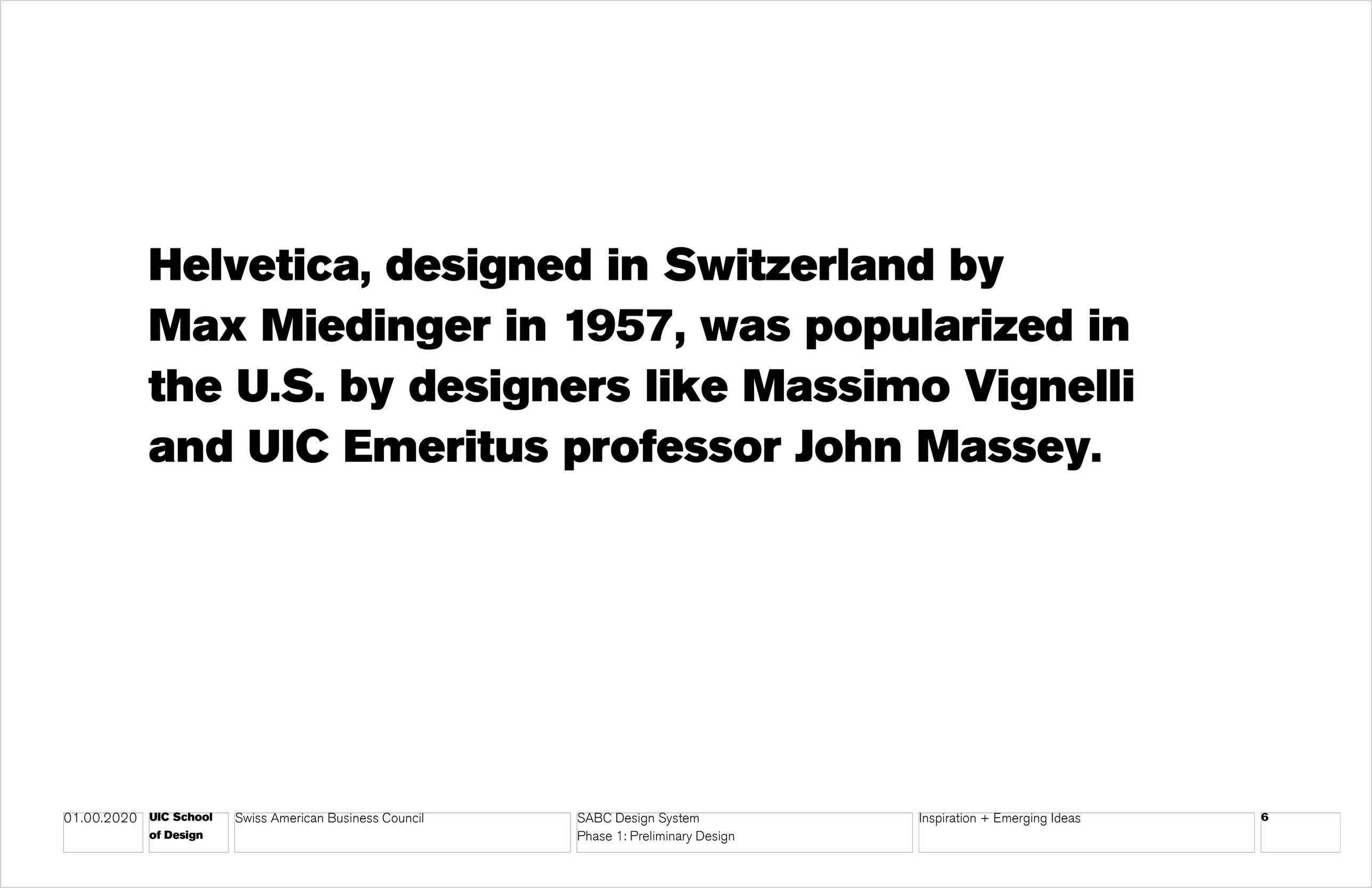
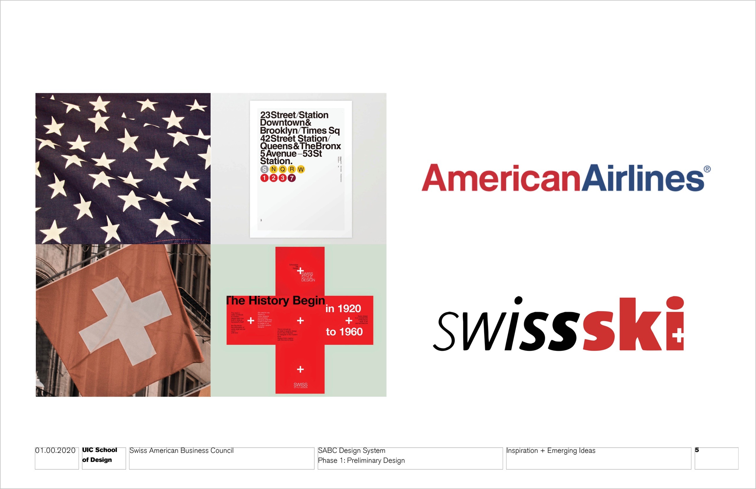
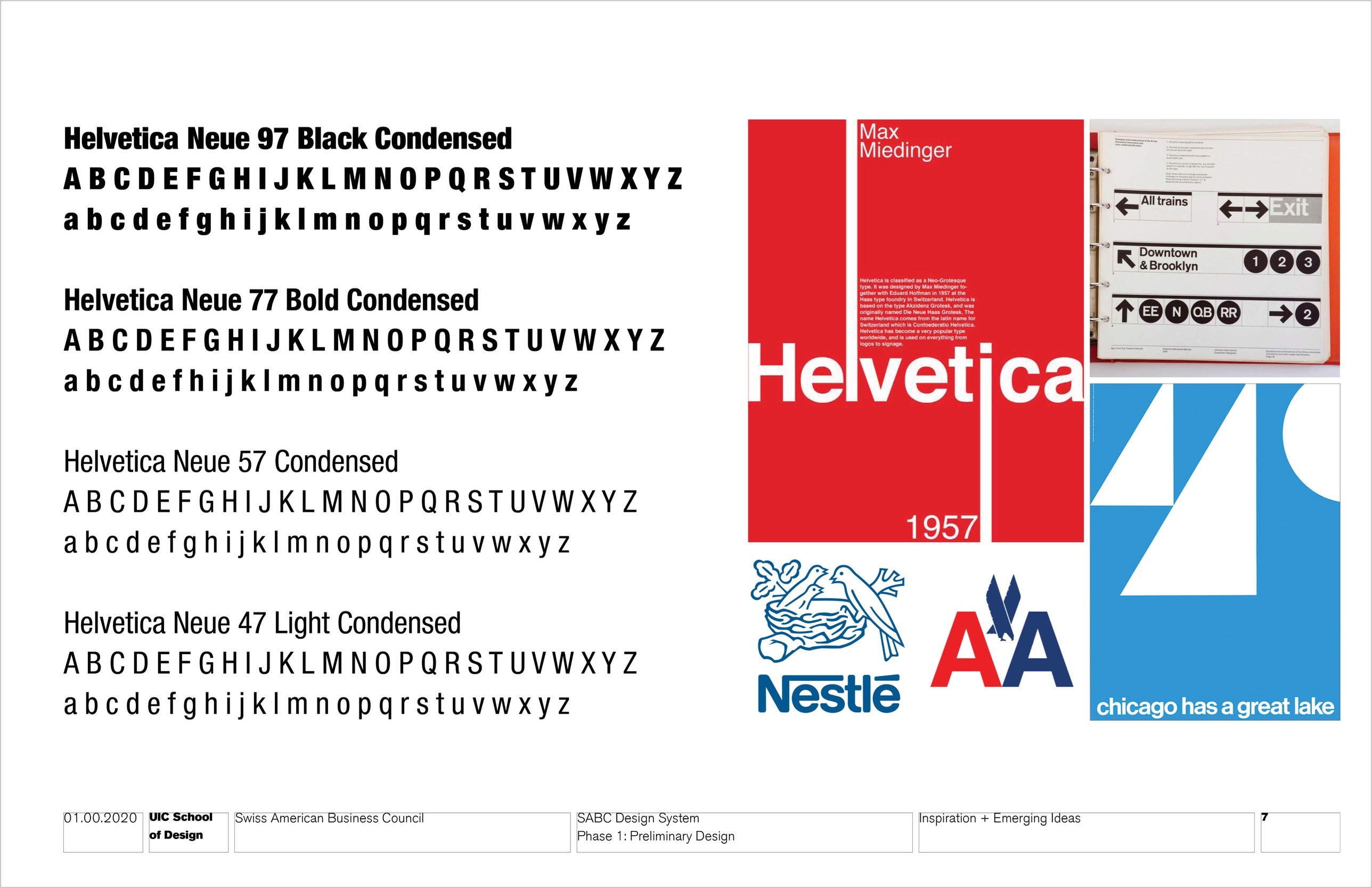
The cross and the star, and Helvetica: a Swiss typeface made famous in the U.S.
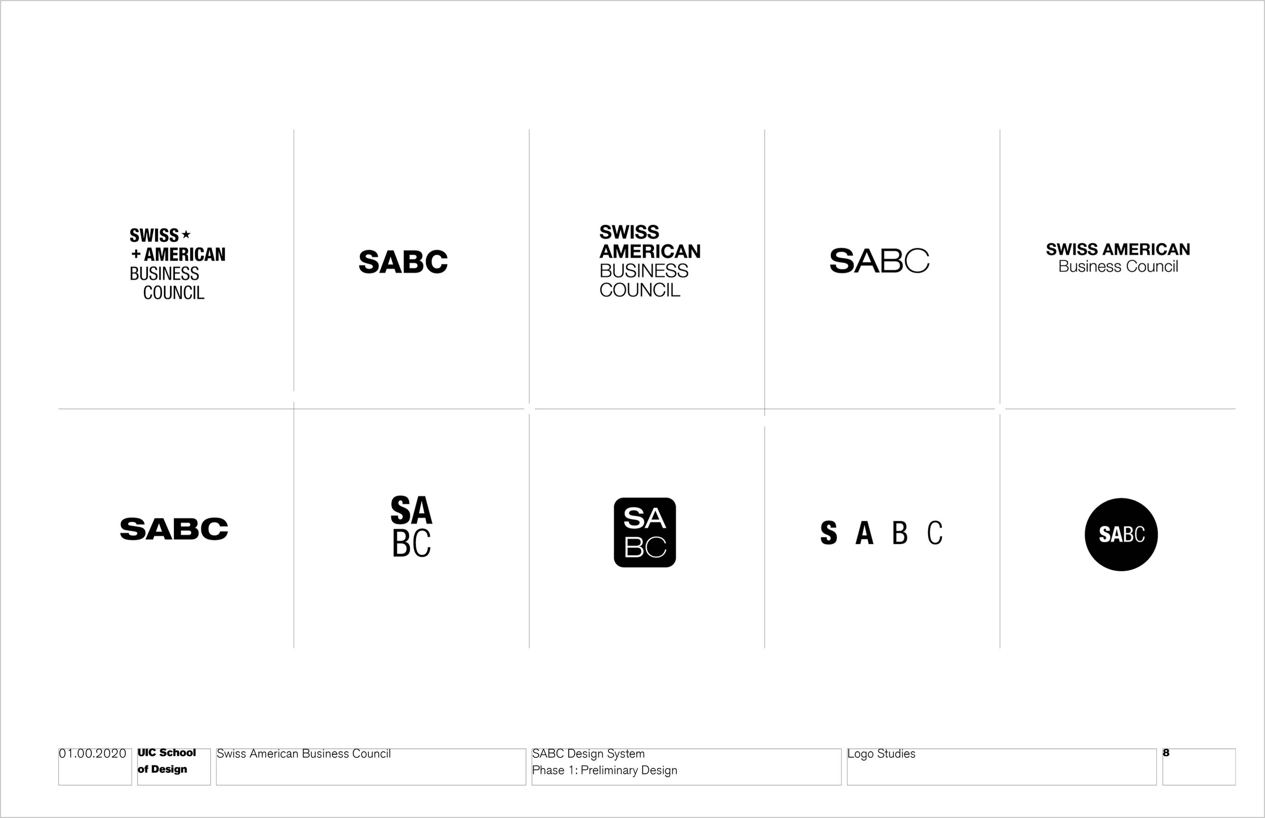
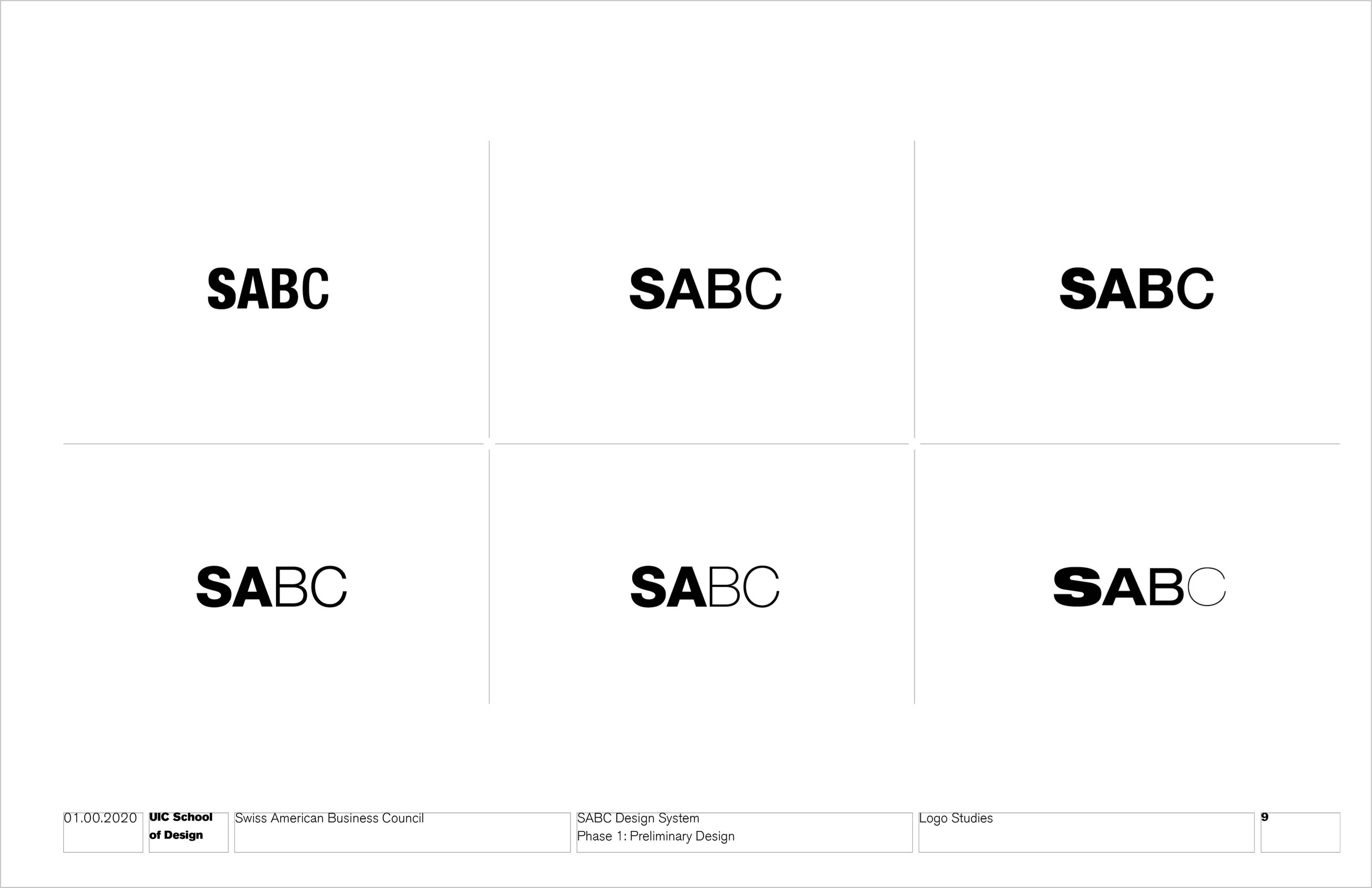
Logo studies
Wordmark explorations testing weight, width and contrast across the four letters.
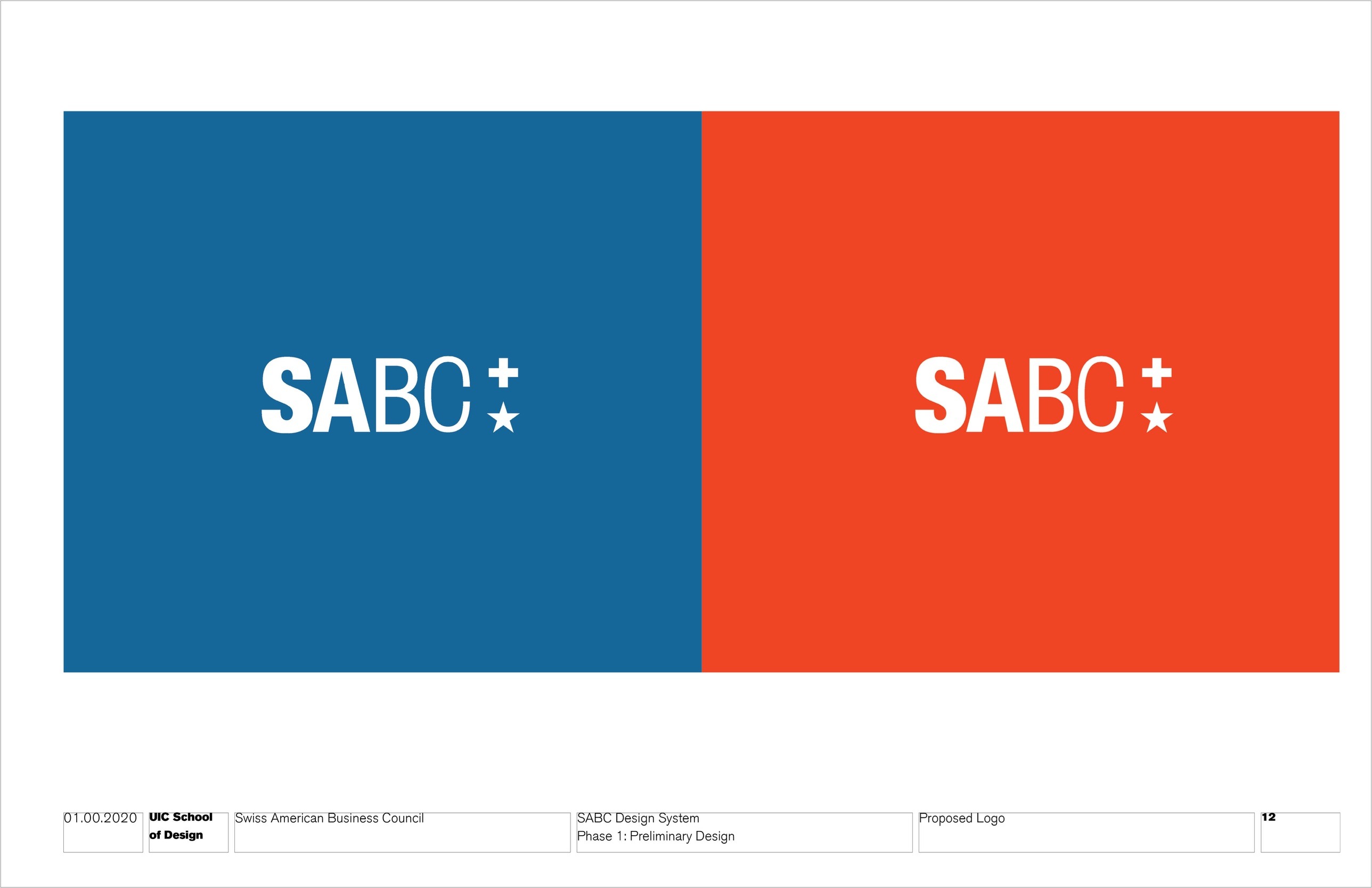
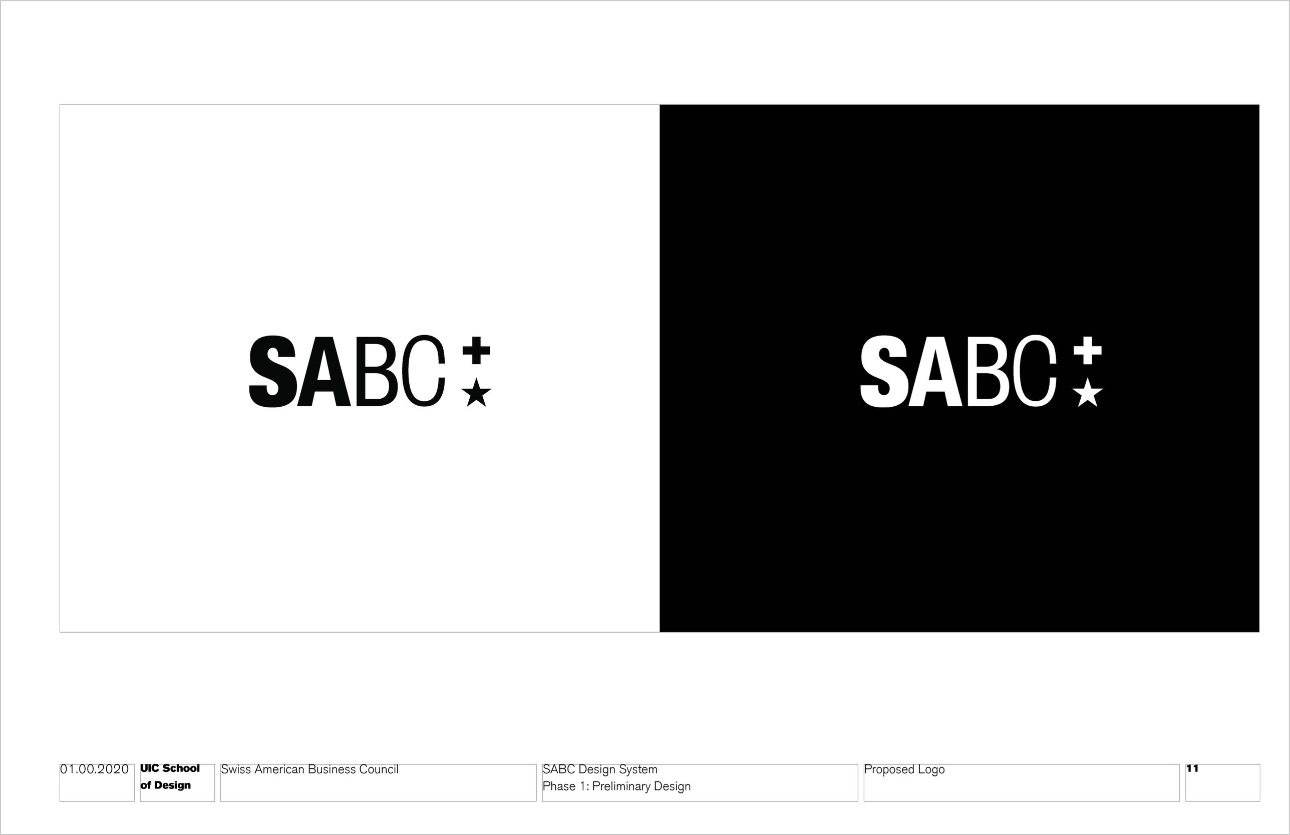
Proposed logo
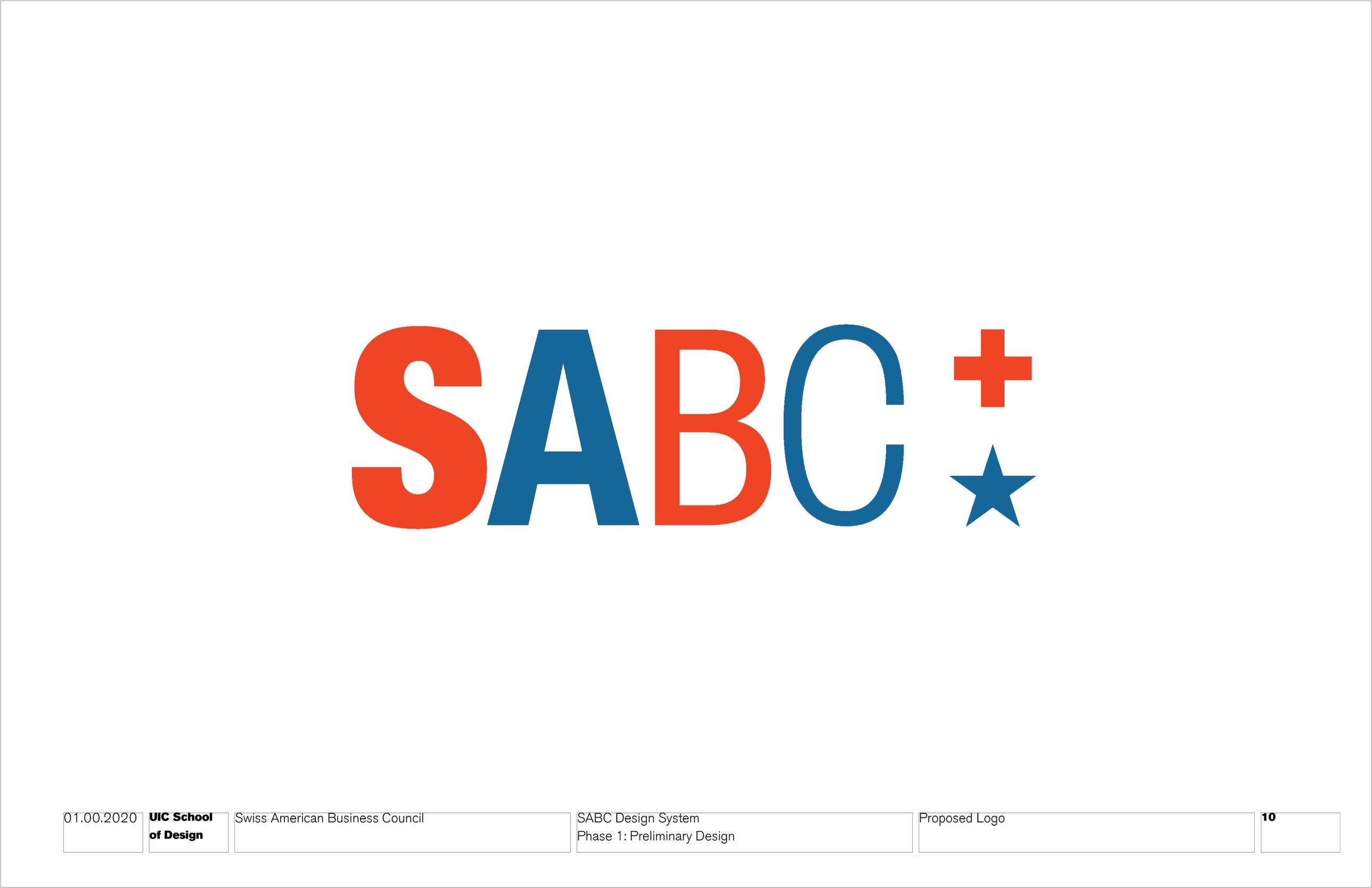
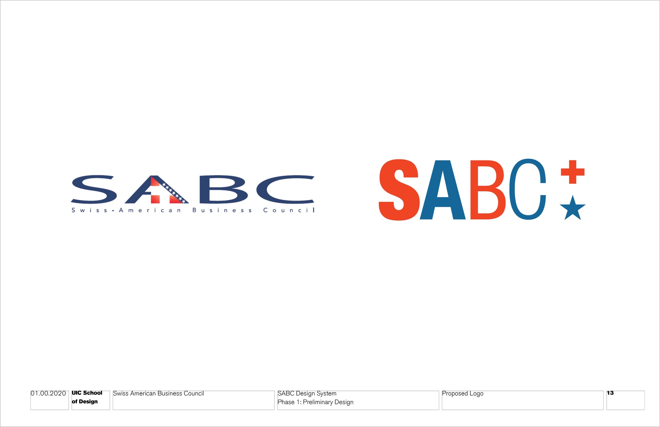
Heavy-to-light Helvetica letters with the Swiss cross stacked over the American star.
The system in use
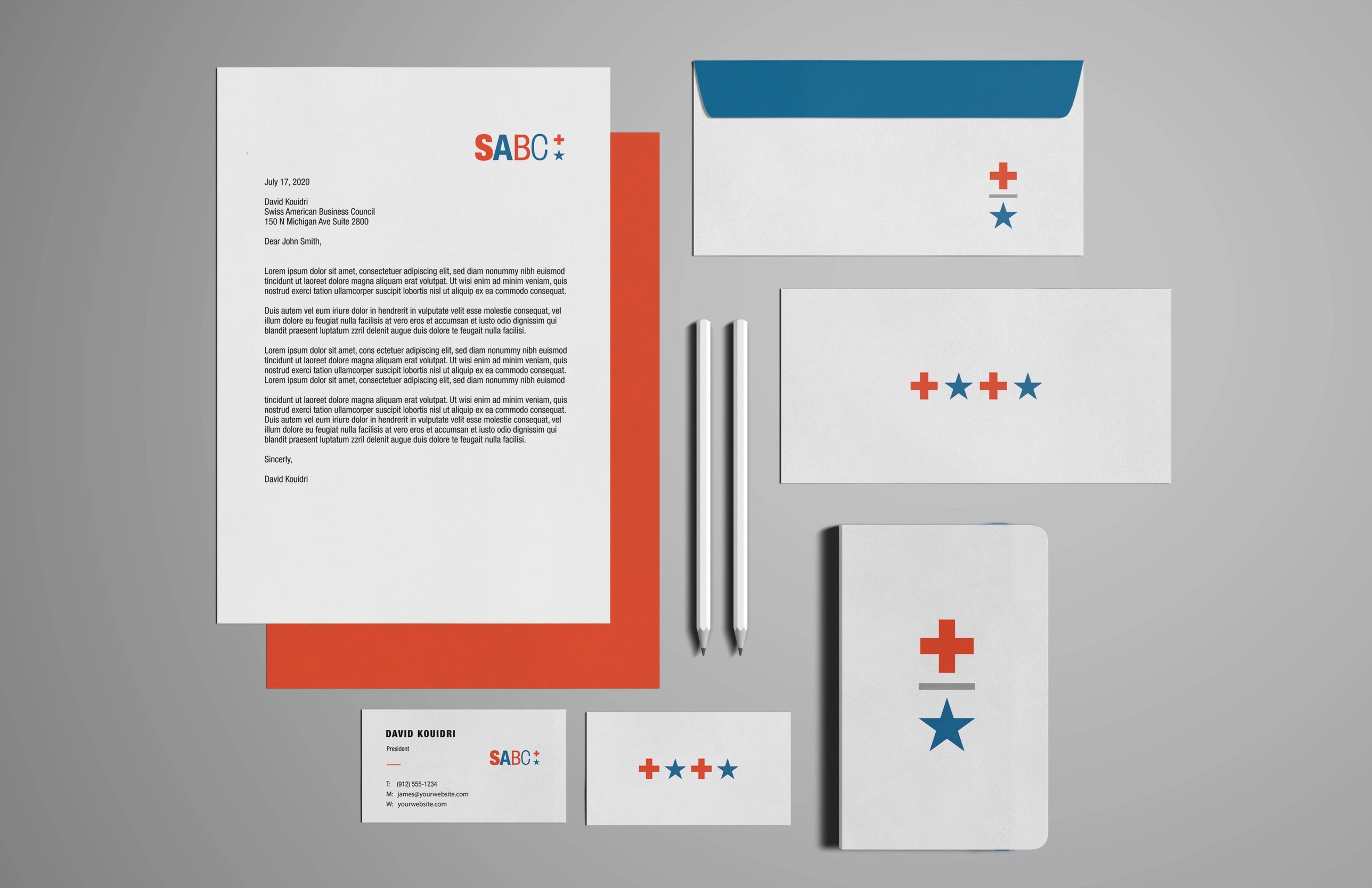
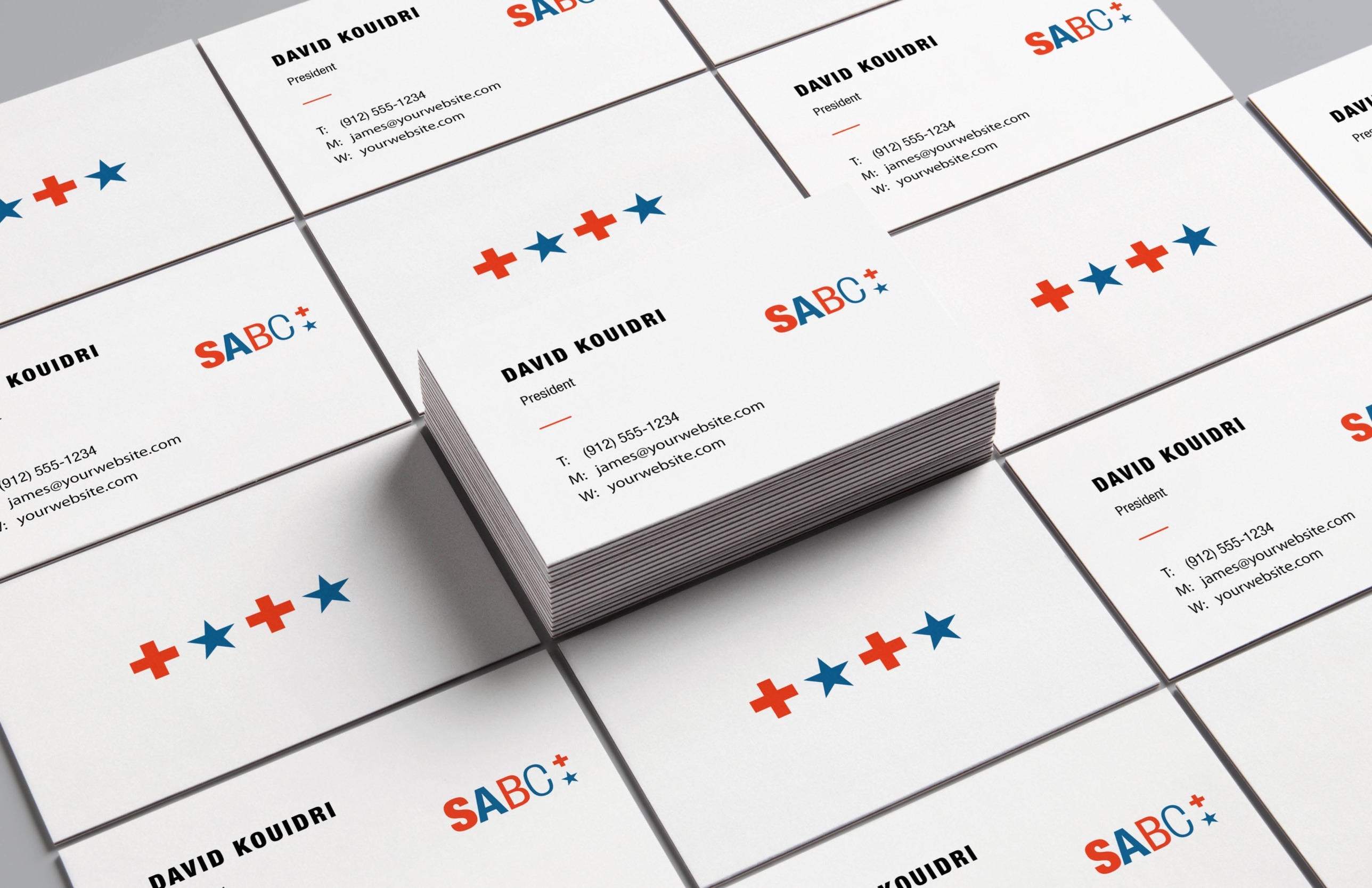
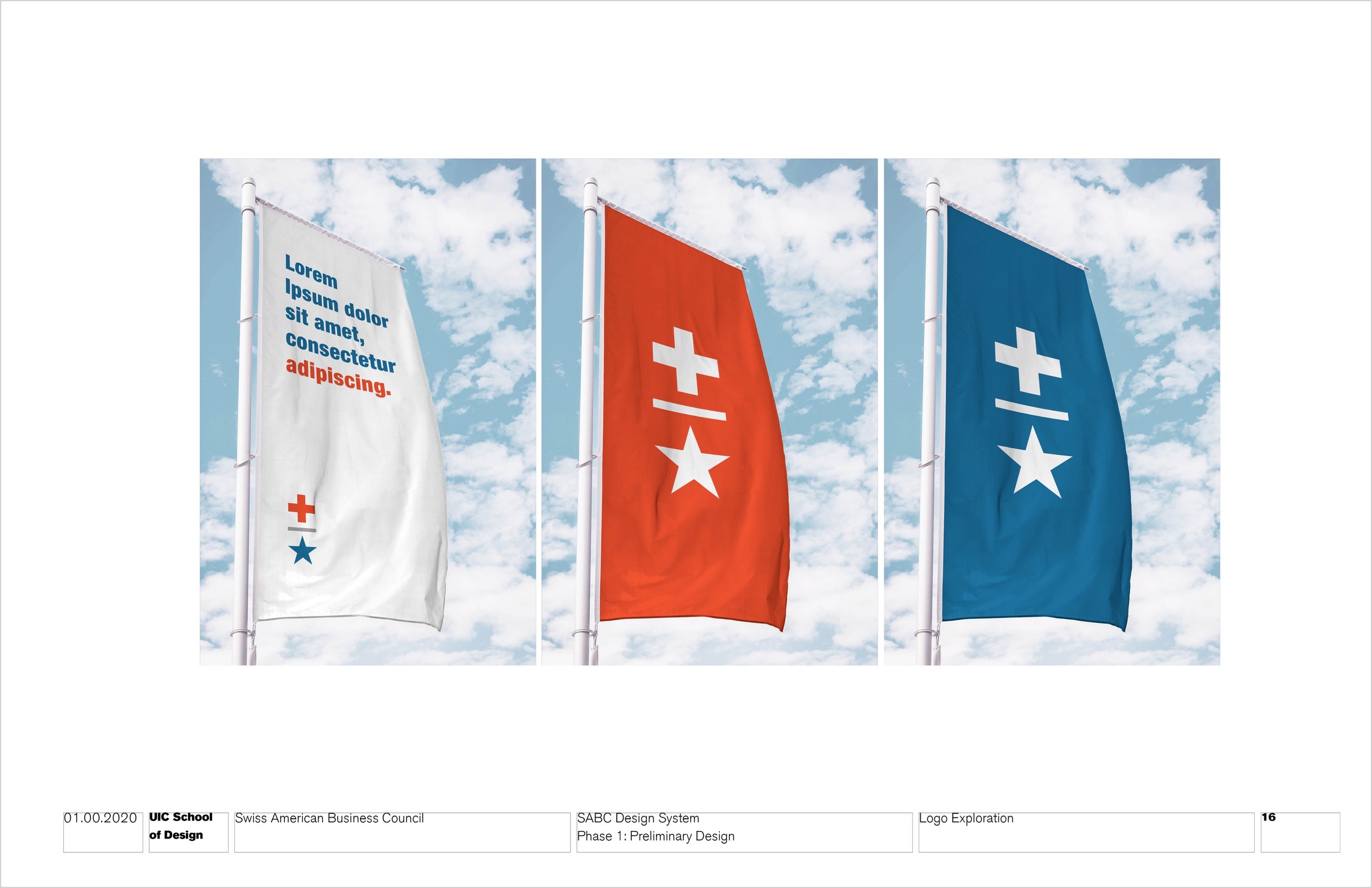
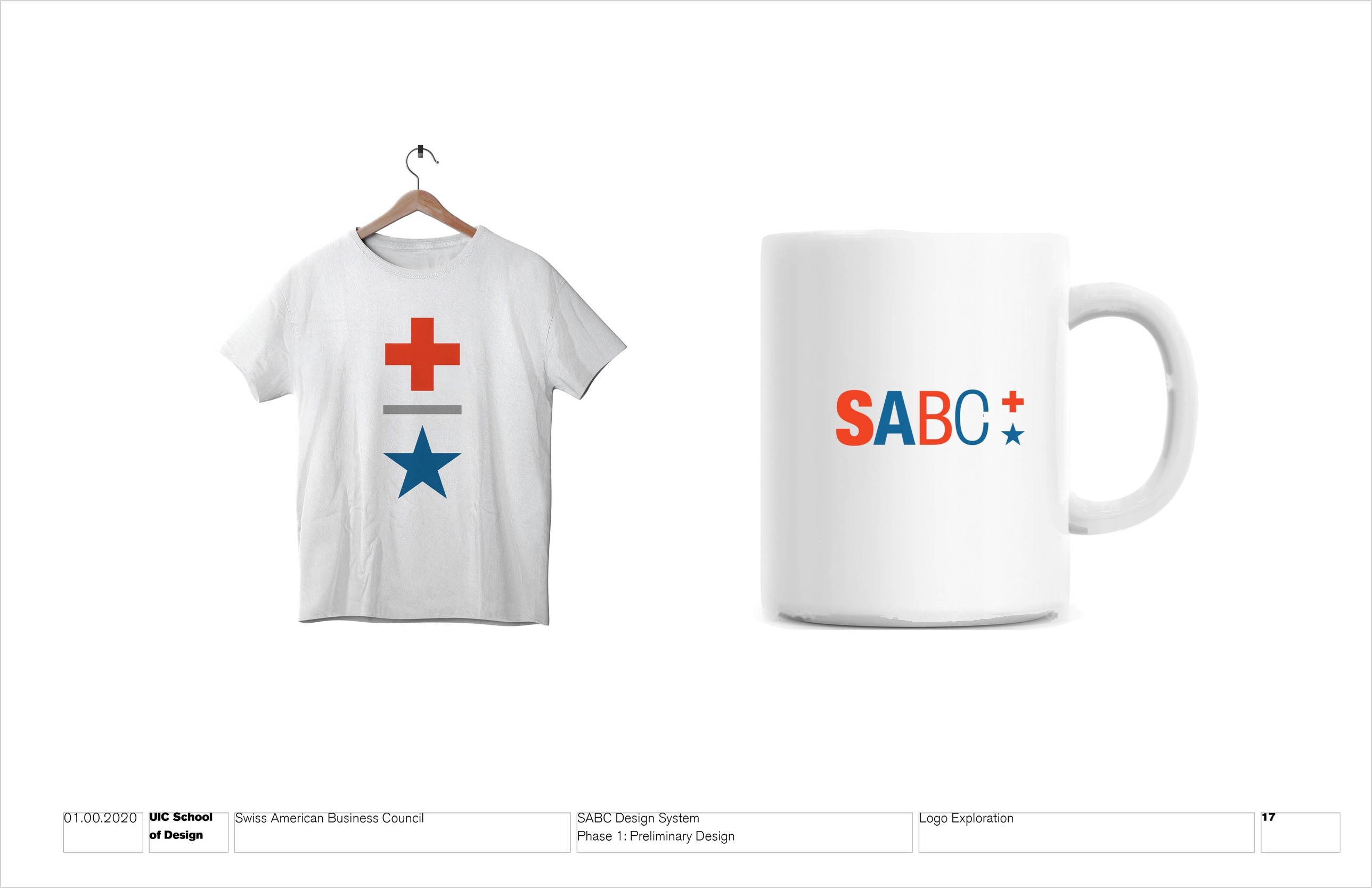
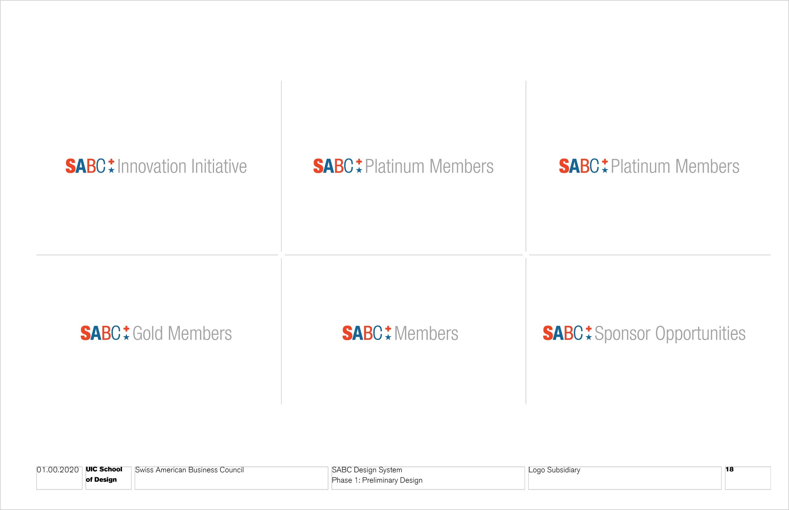
The cross and star become a pattern and a stacked mark across print, signage and merchandise.